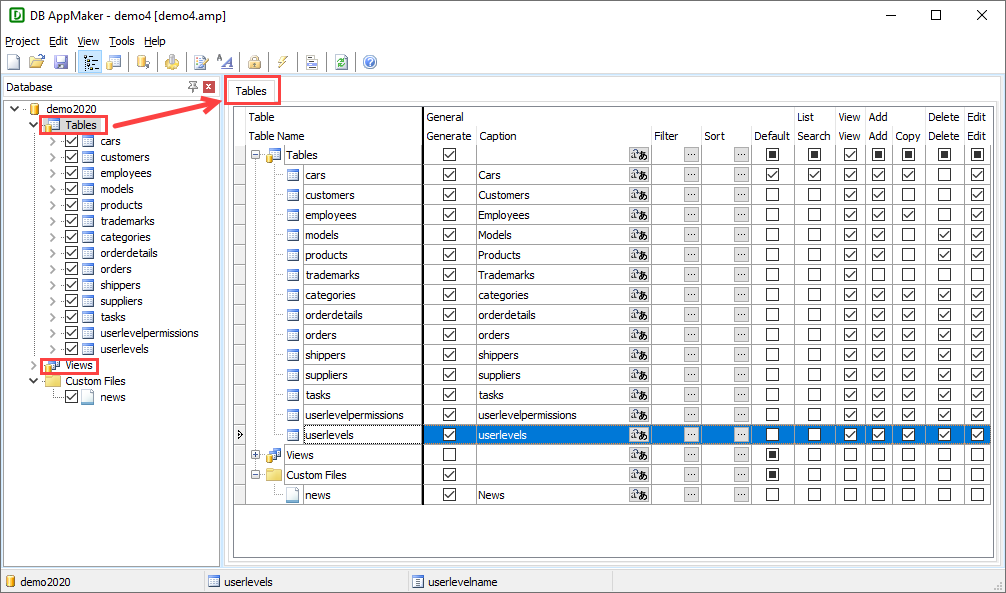
After loading the database, the tables will be shown in the database pane on the left pane.
You can click on the Tables or Views node in the database pane to go to the Tables setup page which is a grid showing some (not all) settings for all tables. If you need to set these settings for multiple tables, this page allow you to view and set them quickly.
If you prefer to view the tables in alphabetical order, click Tools -> Sort Tables Alphabetically (see Tools).
You can still change the display order of the tables by drag-and-drop. Simply single field by clicking the table name (or select multiple fields by ctrl-clicking or shift-clicking the table names), then drag and drop to where you want. Note that a table cannot be moved out of its parent node.
Note that changing the display order of table in this Table Setup page does not change the display order of the tables in the menu. To change the display order of the menu item, click Tools -> Menu Editor (see Tools).
To access settings for a particular table, click the table node of any table in the database pane and then click the Table tab to go to the Table Setup page. This is the setup page for a single table.
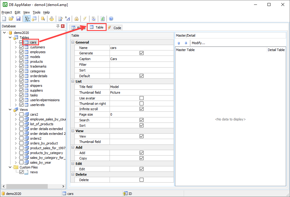
The available table level settings are as follows:
| Name | Table name |
| Generate | Select/unselect the table for generation |
| Caption |
Caption of the table. Note If you use
Multi-Language (see Config Settings), use
Multi-Language Property Editor, see Tools for details.
|
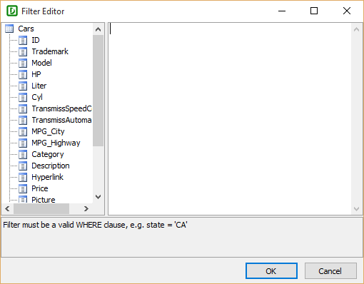
| Filter |
Specify a server side default filter (WHERE clause) for the table. Click the [...] button in Filter column, the Filter Editor will popup. Enter your filter, you can drag the field names from the left pane to the editor, the SQL identifier quote characters will also be added for you automatically.
Note The filter must be a valid WHERE clause (without the
"WHERE" keyword).
|
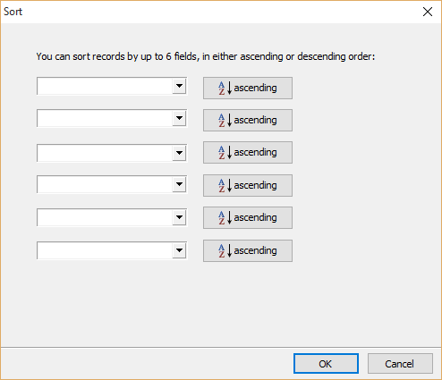
| Sort |
Specify server side default sort fields (ORDER BY clause) for the table. Click the [...] button in Sort column, the following dialog box will popup. You can choose up to 6 fields, in either ascending or descending order.
|
| Default | Set a Table as the Default Table. The Default table is the first table the user see when opening the app. If not specified, the first table will be used. |
| Title field |
Specifies the Title field. The field value should be a short description of the item, e.g. product name. Note This field must be selected to
show in the List page, see Field Setup.
|
| Thumbnail field |
Specifies the Thumbnail field. The field value should be an image file name (without file path) to be used as thumbnail for the item. Note This field must be selected to
show in the List page, see Field Setup.
Notes
|
| Use avatar | Use the avatar effect for thumbnail |
| Thumbnail on right | Put the thumbnails on right side |
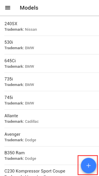
| Infinite scroll | Enable InfiniteScroll which will load more records when the user scrolls a specified distance from the bottom or top of the page. |
| Page size | Number of records to be shown in the List page. If unspecified, the global page size of 30 will be used, you can adjust global page size under the Config -> General tab (see Config Settings). |
| Search | Specifies whether the page allows searching.
Notes
|
| Sort | Specifies whether the page allows sorting.
Notes
|
| View | If enabled, a View page for the table will be generated (for displaying a record). Default is enabled. |
| Thumbnail field |
Specifies the Thumbnail field. The field is used as thumbnail for the record in the View page and the thumbnail will be placed at the top of the page. The field value should be an image (binary data or file name), and the field should be displayed by the Image View Tag, see View Tag in Field Setup. Note This field must be selected to
show in the View page, see Field Setup.
Note By default thumbnails in View page are not resized and are with styles max-width: 100% and height: auto, if your images are very large and you prefer specific width/height, you can set the default thumbnail sizes by Advanced Settings, then the images will be resized on the server side. |
| Add |
If enabled, an Add page for the table will be generated (for adding/copying a record). Default is enabled.
 Notes
|
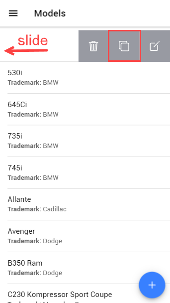
| Copy |
If enabled, Add page will be generated and "Copy" links will be generated for record(s) in List/View page (for copying). Default is enabled. (If this setting is enabled, the "Add" setting is also enabled by default as copying requires the Add page.)
 Notes
|
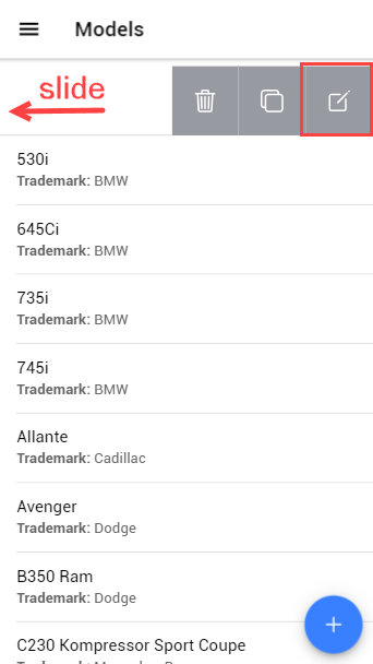
| Edit |
If enabled, an Edit page for the table will be generated (for updating a record). Default is enabled.
 Notes
|
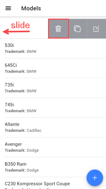
| Delete |
If enabled, a Delete button will be generated. Default is enabled.
 Notes
|
You can establish master/detail (one-to-many) relationship between two tables as follows
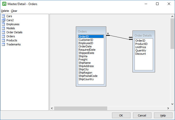
If you want to remove a relationship, select the link in the diagram and click Delete. After setup, click OK to confirm.
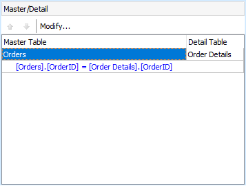
In most cases, master and detail tables are joined by one field, you have one link between the master/detail table and you have one row in the Master/Detail panel only.
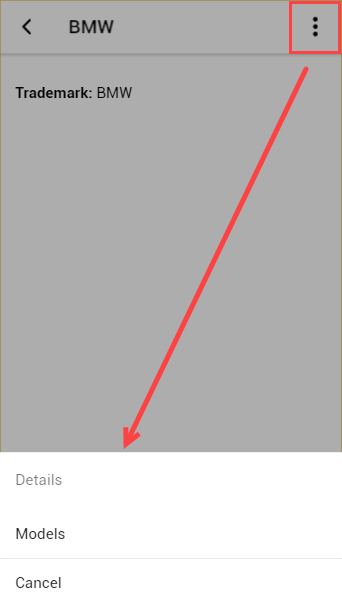
In the generated app, to see detail records of a master record, go to the View page of the master record and click the button at top right: