After loading the database, the database objects (tables and views) will be shown in the left pane (the database pane). Click on any table to go to the Field Setup Page for that table at any time.
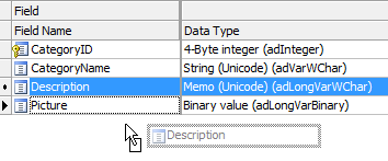
DB AppMaker support most commonly used data types. If DB AppMaker finds any unsupported fields in a table, an Unsupported Fields tab will appear. You can click on the tab to view the list of fields that are not supported.
The Field Setup pages consists of two section. The upper section is a grid showing available options of all fields. The lower section contain two panels, the View Tag panel and the Lookup Table panel for the selected field.
The grid consists of the following sections:
| Field Name | Field Name (read only). You can select multiple fields by ctrl-clicking or shift-clicking field name(s) in this column and do the follows: Change Field Display Order by Drag-and-Drop . |
| Data Type | Data Type (read only) |
| Size | Maximum field length (read only) |
| Caption | Field caption to be displayed |
| Primary Key | Primary Key of the table. Composite key is supported. Important You should use the same primary key as declared in the database, do not change it unless
you are absolutely sure that the selected field(s) values are unique. Otherwise a record cannot be located properly and unexpected results may occur. |
| Auto-Update Value | A dynamic value to update the field automatically in Add/Edit pages. The dropdown list for this setting is preloaded with a few functions for your selection. For example, you may want to record the last modified date of a record, then you can select "CurrentDate()". Do not select a function that return values of unmatching data type, for example, you should not select a function that return a non-numeric string for a numeric field. Notes
|
| Show | Show field in List page. By default the field will be displayed like: <field caption>: <field value> If you want to change the CSS styles for the field caption, you can customize the CSS class field-caption under HTML -> SCSS -> User tab, see HTML Settings. For memo fields, the caption will not be displayed by default unless you have enabled Max Length (List page) (see below). By default one field per line only. If want your own layout, use Custom Templates. |
| Sort | Enable runtime sorting and allow sorting by the field. In the generated app, there will be a "sort" icon at the top right corner of the List page, click the icon and user will be able to sort the items. 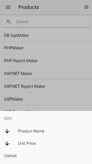 Notes
|
| Search | Enable field for search in List page. |
| View | Show field in View page. By default the field will be displayed like: <field caption>: <field value> If you want to change the CSS styles for the field caption, you can customize the CSS class field-caption under HTML -> SCSS -> User tab, see HTML Settings. For memo fields, the caption will not be displayed by default. By default one field per line only. If want your own layout, use Custom Templates. |
| View Tag | HTML tag to display the field for viewing (see below for details). Used in List/View pages. You can either click the View Tag column and select a View Tag from the drop down box or click the icon on the View Tag panel toolbar to select. After selecting the View Tag, you can further setup its properties in the View tag panel. |
There are two types of View Tag, Formatted Text and Image.
Formatted Text - View Tag to display the field value as formatted text with optional hyperlink. Properties:
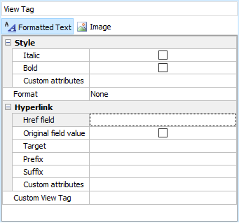
| Style | |
| Italic | Display as italic |
| Bold | Display as bold |
| Custom Attributes | Other custom attributes for the field in JavaScript as JSON, e.g. {"attribute": "value"} |
| Format | |
| None | No formatting |
| String | Format the field value as string |
| Number | Display as formatted number |
| Date/Time | Display as formatted date |
| Currency | Display as formatted currency |
| Percent | Display as percentage |
| Custom | Custom format, see Pipe below. |
| Date/Time format | Date/time format.
Possible values of Date/Time named format are:
where
Note Above formats do not include the date or time separator, the actual date or time separator during runtime is determined by Angular locale, see Internationalization (i18n). |
| No. of digits after decimal | The number of digits after decimal, for use with Currency, Percent or Number. |
| Replace CR+LF by <BR> | Display the fields with CR+LF replaced by <BR> Note This setting only applied to memo fields. |
| Max width (List page) | Truncate the field value at specified max. length and append "..." to the end. Note This setting only applied to memo fields in list page and must be larger than 0 to take effect.
|
| Pipe | Optional. Angular pipe for the format. A pipe takes in data as input and transforms it to a desired output. (Read Pipes for details.) The following pipes can be used:
Notes
|
| Hyperlink | |
| Href field | Display the field as hyperlink with the href attribute set to the value of this field. It can be the field itself. |
| Original field value | Use original field value of the Href field in the hyperlink instead of display field value. If the Href field has lookup table or user values, by default the display value will be used. If this option is enabled, the original field value will be used instead. |
| Target | The target in which to load the URL, an optional parameter that defaults to _self.
|
| Prefix | Prefix added before the Href field value. Note This setting is a string to be quoted by backtick (` `) so that it will be template literal.
For example, you can enter: (no quotes) mypage/ The value of the Href field will be appended to the end of the your prefix in the outputted HTML. If you want pass a field value, you can enter: (no quotes) mypage/${row.myField.value)/ |
| Suffix | Suffix added after the Href field value. You can use this setting to append additional URL parameters. Note This setting is a string to be quoted by backtick (` `) so that it will be template literal.
For example, you can enter: (no quotes) &myfield=${row.myField.value} Note If the suffix is URL parameter(s), you should use ? (if no other URL parameter) or & (if other URL parameter exists) at the beginning of the string. |
| Custom Attributes | Custom attributes for the hyperlink in JavaScript as JSON, e.g. {"attribute": "value"} |
| Custom View Tag | |
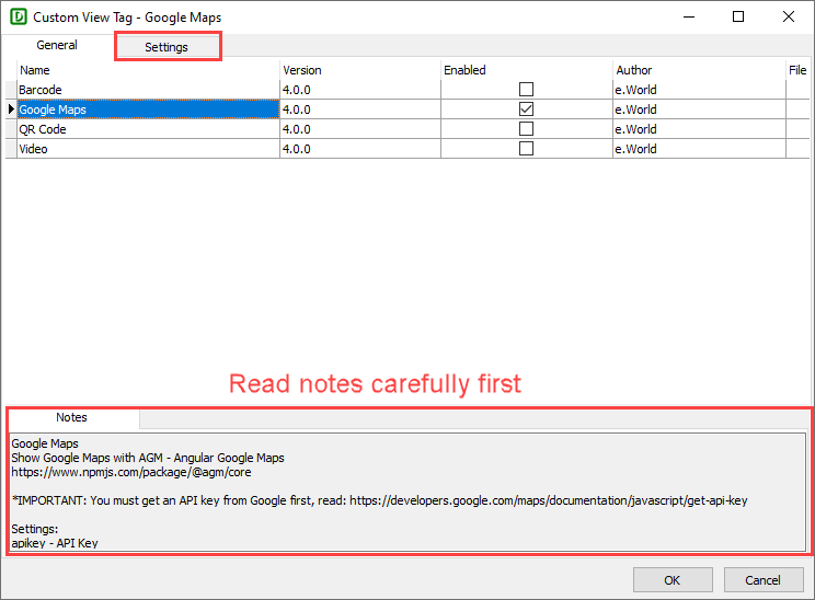
| Custom View Tag | Display the field value in List/View page by custom code. Important Custom View Tag overrides ALL above View Tag settings.
There are some ready-to-use Custom View Tag for you to choose:
If your data stores information for above, just click the down arrow button to open the setup form, enable one of them, read the notes at the bottom panel carefully, then click the Settings tab to setup, and click OK to save your settings.
Notes
If you want absolute freedom, click the [...] button to enter your own code to display the your data. Notes
|
Image - Display the field as Image, audio or video. The field should be a BLOB field or a field storing the file name of an image.
Notes
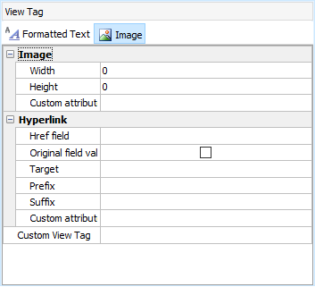
| IMG Tag attributes | |
| Width | Specify the width of the image in pixels |
| Height | Specify the height of the image in pixels |
| Custom attributes | Other custom attributes for the image field in JavaScript as JSON, e.g. {"attribute": "value"} |
| Hyperlink and Custom View Tag (same as above) | |
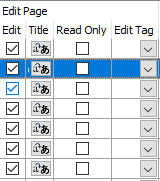
| Edit | Show field in Edit page |
| Title | Alternative text to be used as placeholder property of the Edit Tag. (See the setting Use place holder under Tools -> Advanced Settings.) Note If you use Multi-Language (see Config Settings), use Multi-Language Property Editor, see Tools for details. |
| Read Only | Make the field read only in Edit page |
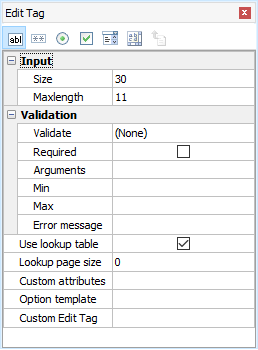
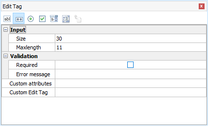
| Edit Tag | Form element for the field. Use in Add/Copy/Edit pages (see below for details). You can either click the Edit Tag column and select a Edit Tag from the drop down box or click the icon on the Edit Tag panel toolbar to select. After selecting the Edit Tag, you can further set up its properties in the Edit Tag panel. |
Edit Tags
Edit Tags are form controls for the field in Add/Copy/Edit pages.
| Text | ion-input tag Display the field as a textbox.
|
||||||||||||||||
| Password | ion-input tag with type="password" Display the field as a masked textbox.
|
||||||||||||||||
| Radio | Ionic Selectable tag Display the field as a single selection list.
|
||||||||||||||||
| Checkbox | ion-checkbox tag Display the field as a single checkbox. For boolean fields only.
Note For MySQL, DB AppMaker considers enum('Y','N') and enum('1','0') as boolean fields. For Oracle, fields with two and only two User Values (see below) and the labels and values are "Y" and "N" (or "1" and "0") will be considered as boolean fields. DB AppMaker will display a boolean field by a checkbox automatically.
|
||||||||||||||||
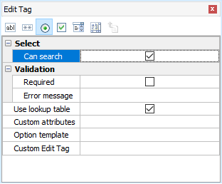
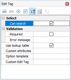
| Select | Ionic Selectable tag Display the field as a single or mulitple selection list.
|
||||||||||||||||
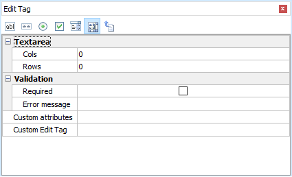
| TextArea | ion-textarea tag Display the field as a textarea.
|
||||||||||||||||
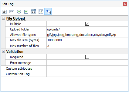
| File | ngx-file-upload tag Display the field as a file upload control. For BLOB fields or string fields only. If the field is of BLOB (binary) data type, file is uploaded to the database. If the field of string type, file is uploaded to a subfolder relative to the project folder.
|
||||||||||||||||
| Custom Edit Tag | |||||||||||||||||
| Custom Edit Tag | Display the field value in Add/Edit pages by custom code. The custom code will be generated Important
To use Custom Edit Tag, click the [...] button to enter your own code to display the your data in your own HTML. |
||||||||||||||||
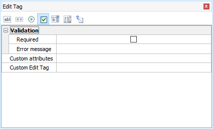
Validation (for Add/Copy/Edit)
The data input for each field can be validated using Angular validators.
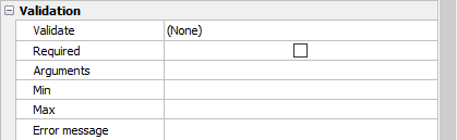
| Validate | Supported validation formats are:
Notes
|
| Arguments | Arguments for validator. For Regular Expression and custom validation functions only. Note This is JavaScript arguments, it should be comma separated (if more than one) JavaScript expressions. e.g. If it is a string, it must be single or double quoted.
If the Validate setting (see above) is Regular Expression, this setting must be a valid JavaScript regular expression pattern along with flags that identify how to apply the pattern (delimit the pattern by "/" characters, not single or double quotes), e.g. /foobar/i See Creating a Regular Expression for more information about the pattern and flags. |
| Required | Check this checkbox if the field is mandatory. Notes
|
| Error message | Enter your own error message to show if error occurs. If not entered, default error messages will be used. Note If you use Multi-Language (see Config Settings), use Multi-Language Property Editor, see Tools for details. |
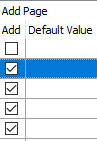
| Add | Show field in Add page |
| Default Value | Default value for field (for adding new record only) . The value must be a valid JavaScript expression. (If it is a string, must be single or double quoted.) |
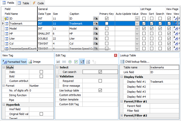
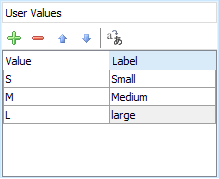
Using User Values for Edit Tag (Radio/Select)
For Radio/Select Edit Tags, the default option values are user input values, you can enter as many value/label pairs as you want in the User Values panel next to the Edit Tag panel.
Using Lookup Table for Edit Tag (Text/Radio/Select)
In real world applications, the option values usually come from a (lookup) table in the database. DB AppMaker make it very simple to use lookup values for key field values, simple click Use Table, the Lookup Table panel will replace the User Values panel, see Lookup Table for details.
Dynamic Selection Lists
DB AppMaker supports Dynamic Selection Lists in which child lookup fields' selection list options change dynamically based on option selected in the parent selection list. To setup child lookup fields, click the Child lookup fields... button and the following setup form will be displayed:
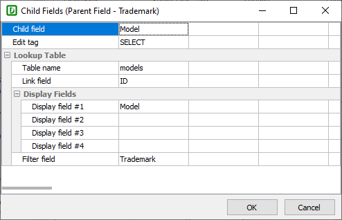
Read Tutorial - Dynamic Selection List for more information.