Field Setup
After loading the database, the database objects (tables, views, custom views, reports and linked tables) will be shown in the left pane (the database pane). Click on any table to go to the Field Setup Page for that table at any time.
Note For simplicity, we use "table" in the following description to refer to any of database object in the project. A database object can be either a table, a view, a Custom View, a report or a Linked Table.
ASP.NET Maker supports most commonly used ADO data type. If ASP.NET Maker finds any unsupported fields in a table, an [Unsupported Fields] tab will appear. You can click on the tab to view the list of fields that are not supported.
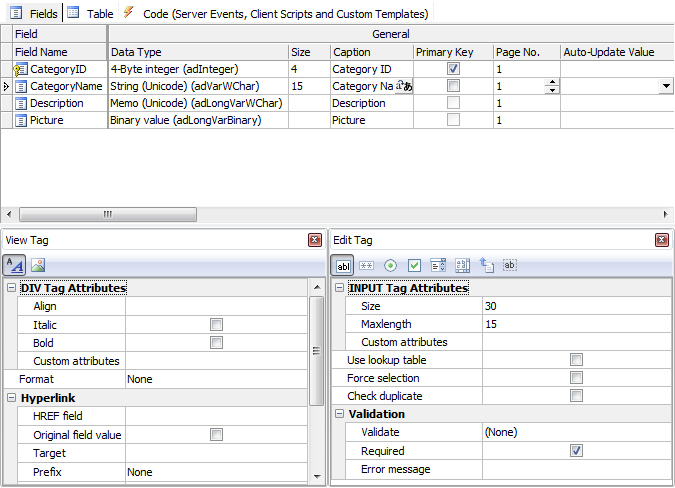
The Field Setup pages consists of two sections. The upper section is a grid showing available options of all fields. The lower section contain two panels, the [Edit tag] panel and the [View tag] panel for the selected field.
The grid consists of the following sections:
General

Properties
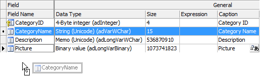
| Field Name |
Field Name (read only) |
| Data Type |
Data Type (read only) |
| Size |
Maximum field length (read only) |
| Expression |
The expression for custom field (Custom Fields only). See also Custom Fields. |
| Caption |
Field caption to be displayed |
| Primary Key |
Primary Key of the table. Composite key is supported.
Important
- You should use the same primary key as declared in the database, do not change it unless
you are absolutely sure that the selected field(s) values are unique. Otherwise a record cannot be located properly and unexpected results may occur.
- Primary key is uneditable in the edit page.
|
| Page No. |
Page number of the field. For use with Multi-Page. By default all the fields are in page 1 and Multi-Page is disabled.
Multi-Page is supported for Add/Edit/View/Search pages, you can optionally enable it for each page. Page labels are also supported. See Table Setup.
If Multi-Page is enabled and the page number is 0, the field will appear in all pages.
Note You can multi-select the fields by ctrl-click or shift-click the Field Name column and then right click to set the page number for the selected fields simultaneously. |
| Auto-Update Value |
A dynamic value to update the field automatically in Add/Edit pages.
The dropdown list for this setting is preloaded with a few methods for your selection. For example, you may want to record the last modified date of a record, then you can select "CurrentDate". Do not select a method that return values of unmatching data type, for example, you should not select a method that return a non-numeric string for a numeric field.
Notes
- This setting will make the field hidden automatically and it overrides the default value in Add page and custom value for Hidden Edit tag in Edit page. (see section below)
- You can add your own ASP.NET static methods, the method must accept no argument and return a value. You can add your method names (comma separated) for the Advanced Settings Auto-Update values (See Tools - Advanced Settings),
e.g. You can enter: (no quotes)
MyAutoValueMethod1(),MyAutoValueMethod2()
Then put your static methods under server side Global Code section, see Server Events and Client Scripts.
|
Change Field Display Order by Drag-and-Drop
You can change the field order defined in the database by simple drag-and-drop. Simply ctrl-click or shift-click the Field Name column to select multiple fields, then drag it to where you want. ASP.NET Maker will generate scripts and display records according to this order.
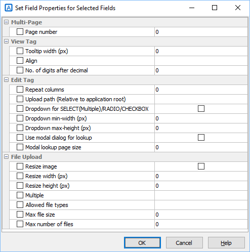
Change Multiple Field Properties
Some field properties allow multi-update. You can ctrl-click or shift-click the Field Name column to select multiple fields, then right click and select Set field properties... to update them at the same time.
List Page
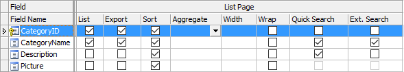
Properties
| List |
Show field in list page
Note The setting is also used for Inline/Grid-Add/Edit and Master/Detail-Add/Edit/View. |
| Export |
Include the field when export |
| Sort |
Allow sorting by clicking the column header |
| Aggregate |
Enable Field Aggregation. Aggregated values will be shown at Page
Footer. Not applicable in multi-column view. Aggregate options include:
- TOTAL (sum of all field values in current page)
- COUNT (count of records in current page)
- AVERAGE (average field value in current page) |
| Width |
Specify CSS width property for field column width. Number, number with unit, or CSS styles are supported, e.g.
| Input (no quotes) |
Output style attribute |
| 200 |
width: 200px |
| 200px |
width: 200px |
| 100% |
width: 100% |
| min-width: 100px; |
min-width: 100px; |
Note If your table is too wide, browsers will try to best fit the content into screen and the specified width may be overridden. |
| Wrap |
Enable/Disable text-wrap for field value. If enabled, style white-space: nowrap; will be added to the table cell.
Note If you enable text-wrap but the field value has no allowed line-breaking points (e.g. spaces or punctuation), the text still cannot be wrapped. |
| Quick Search |
Include this field when performing Quick(Basic) Search in the List page.
Note Only text fields and numeric fields are supported in Quick Search. By default only text fields are enabled. |
| Ext. Search |
Use this field in Extended Quick Search
Extended Quick Search is enhancement of Quick Search. If a field is checked for Ext. Search, a form element for the field will be shown in the Quick(Basic) Search form and the user input criteria for this field will be included when performing Quick(Basic) Search.
Extended Quick Search will use the same search operators specified under the "Advanced Search Page" section (see below).
Note Extended Quick Search only works with field selected to show in the List page or the search criteria cannot be highlighted (if enabled, see Table Setup) and may confuse some users.
|
View Page
Properties
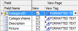
| View |
Show field in view page |
| View Tag |
HTML tag to display the field.
Used in List/View pages. |
You can either click the [View Tag] column and select a View Tag from the drop down box
or click the icon on the View Tag panel toolbar to select. After selecting the View Tag, you can further setup its properties in the View tag panel.
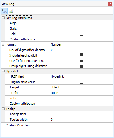
View Tag
There are two types of View Tag, Formatted Text and Image.
Formatted Text - View Tag to display the field value as formatted text using <div> tag with optional hyperlink. Properties:
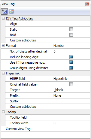
| DIV Tag attributes |
| Style |
Align - Left/Center/Right/Justify. Align the data.
Italic - Display as Italic
Bold - Display as Bold
|
| Custom Attributes |
Other custom attributes for the <div> or <span> tag. For example, you can enter as string, e.g. (string with double quotes)
"onmouseover='my_js_function();' onmouseout='my_js_function2();'"
or preferably as a Dictionary , e.g.
new Dictionary<string, string> {{"onmouseover", "my_js_function();"}, {"onmouseout", "my_js_function2();"}}
Notes
- The setting must be a valid C# expression. If it is string, it should be double quoted.
- If you use your own JavaScript functions for the client events. You can put your JavaScript functions in the Global Code for client scripts (see Server Events and Client Scripts) so it is available for use in the generated scripts.
- Sometimes the generated code already uses some attributes (e.g. onchange event, class attribute, style attribute), if you add the same attribute/event using the string format, there will be more than one event/attributes of the same name and it will be ignored by browsers. But if you add the same attribute using the Dictionary format, the attributes will be concatenated together. Therefore, the Dictionary format is recommended over the string format.
|
| Format |
| None |
No formatting |
| Currency |
Display as formatted currency |
| Date/Time |
Display as formatted date. Possible values of Date/Time named format are:
- Default - based on locale file
- DateTime - Date and time, format based on locale file
- Date - Date only, format based on locale file
- Time(AM/PM) - 12-hour with AM/PM
- Time - 24-hour
- Ymd
- mdY
- dmY
- YmdHis
- mdYHis
- dmYHis
- ymd
- mdy
- dmy
- ymdHis
- mdyHis
- dmyHis
- YmdHi
- mdYHi
- dmYHi
- ymdHi
- mdyHi
- dmyHi
where:
- Y - A full numeric representation of a year, 4 digits
- y - A two digit representation of a year
- m - Numeric representation of a month, with leading zeros, 01 through 12
- d - Day of the month, 2 digits with leading zeros, 01 to 31
- H - 24-hour format of an hour with leading zeros, 00 through 23
- i - Minutes with leading zeros, 00 to 59
- s - Seconds, with leading zeros, 00 through 59
Note
- Above formats do not include the date or time separator, the actual date or time separator during runtime is determined by locale file (see Tools -> Locale Settings).
- For Default, DateTime, Time(AM/PM) and Time, the time format is also affected by the advanced setting Use Date/Time without seconds (see Advanced Settings).
|
| Number |
Display as formatted number |
| Percent |
Display as formatted percentage |
| String |
Format the field value with specified string function. |
| Replace CR+LF by <BR> |
Display the fields with CR+LF replaced by <BR>
Note This setting only applied to memo fields. |
| Max Length (List page) |
Truncate the field value at specified max. length and append "..." to the end.
Note This setting only applied to memo fields in list page and must be larger than 0 to take effect. |
| Hyperlink |
| HREF field |
Display the field as hyperlink with the href attribute set to the value of this field. It can be the field itself. |
| Original field value |
Use original field value of the Href field in the hyperlink instead of display field value.
If the HREF field has lookup table or user values, by default the display value will be used. If this option is enabled, the original field value will be used instead. |
| Target |
Target attribute of the hyperlink. Possible values are: _top, _parent, _self, or _blank. You can also enter your own. |
| Prefix |
Prefix added before the HREF field value. You can select one of the follows:
- (None)
- http://
- mailto:
- ftp://
- file://
- news://
You can also enter your own partial URL (to be ended with the HREF field value).
Note This setting is a string to be quoted by double quotes.
For example, you can enter: (no quotes)
mypage?id=
The value of the HREF field will be appended to the end of the your prefix in the outputted HTML.
If you want pass a field value, you can use interpolated string, e.g. you can enter: (no quotes)
mypage?myfield={UrlEncode(MyField.CurrentValue)}&id=
This example assumes that MyField is string so you should URL-encode the field value. |
| Suffix |
Suffix added after the HREF field value. You can use this setting to append additional URL parameters.
If you want pass a field value, you can use interpolated string, e.g. you can enter: (no quotes)
&field2={UrlEncode(Field2.CurrentValue)}
Since this is a suffix, you should always use "&" at the beginning of the string. This example assumes that Field2 is string so you should URL-encode the field value. |
| Custom Attributes |
Custom attributes for the <A> tag.
For example, you can enter: (with double quotes)
"rel='xxx'"
or preferably as Dictionary
new Dictionary<string, string> {{"rel", "xxx"}}
Notes
- The setting must be a valid C# expression. If it is string, it should be double quoted.
- If you use your own JavaScript functions for the client events. You can put your JavaScript functions in the Global Code for client scripts (see Server Events and Client Scripts) so it is available for use in the generated scripts.
- Sometimes the generated code already uses some attributes (e.g. onchange event, class attribute, style attribute), if you add the same attribute/event using the string format, there will be more than one event/attributes of the same name and it will be ignored by browsers. But if you add the same attribute using the Dictionary format, the attributes will be concatenated together. Therefore, the Dictionary format is recommended over the string format.
|
| Tooltip |
| Tooltip field |
Display the field as tooltip |
| Tooltip width |
The width of the tooltip in pixels. Default is 0 (auto).
By default the width is not specified and the width will depend on the field value. However, when the tooltip field is a long text field, the width can take up the browser width, which may be unwanted. Then you can specify a value to limit the width. |
| Custom View Tag |
| Custom View Tag |
Display the field value in List/View page by custom code.
Important Custom View Tag overrides ALL above View Tag settings.
There are some ready-to-use Custom View Tag for you to choose:
- Google Maps
- Barcode and QR code
- YouTube videos
If your data stores information for above, just click the down arrow button to open the setup form, enable one of them, read the notes at the bottom panel carefully, then click the Settings tab to setup, then click OK to save your settings.
Notes
- Only one of above Custom View Tag can be selected at a time. All records will use the same Custom View Tag. For instance, you can NOT use Barcode for a record and use Google Maps for next record.
- The above Custom View Tags are provided as examples only. The third party tools used are not developed by the author of ASP.NET Maker and are not part of ASP.NET Maker, NO TECHNICAL SUPPORT WILL BE PROVIDED.
You can also create your Custom View Tag, they are implemented in exactly the same way as template extensions (see Customizing Template). Custom View Tags must be placed under the subfolder "customviewtags" of the installation folder. Each Custom View Tag must have a XML description file so it can be loaded for selection. You can open an XML file in the "customviewtags" subfolder to see the content, which is self-explanatory. Unzip the zip file to see how it is implemented.
If you want absolute freedom, click the [...] button to enter your own code to display the your data in your own ASP.NET Razor code, HTML and JavaScript.
Important If you choose to enter your own code, you are completely on your own to display the field value. Intermediate knowledge in ASP.NET Razor, HTML, CSS and JavaScript is required.
Custom View Tag is HTML , if you want to embed C# code, you need to use Razor syntax, if you want to use JavaScript, you need to use "<script>" and "</script>".
Note You can use CurrentPage to get the current page object.
Custom View Tag supports the following tags:
| {{{old_tag}}} |
The old (original) Edit Tag, that is, the original code for the field. If you need to reuse the original code without changes (e.g. you just add some additional code for the field), you can use the special tag {{{old_tag}}} in your code
Example 1
{{{old_tag}}}
...Your HTML...
Example 2
If {{{old_tag}}} is inside JsRender template, it will only be converted to a JsRender Include tag {{include tmpl=... /}} to include the template of original code.
<script class="ew-js-template" type="text/html">
{{{old_tag}}}
...Your HTML...
</script> |
| {{{value}}} |
The CurrentValue of the field object. It will converted to @<page>.<field>.CurrentValue. Note that it includes the @tags, use it in HTML only, do not use it in C# code. |
| {{{view_value}}} |
The ViewValue of the field object. It will converted to @<page>.<field>.ViewValue. Note that it includes the @tags, use it in HTML only, do not use it in C# code. |
The above tags are just some helper tags, you can write your own Custom View Tag without using them at all.
Example 3
Output the field value conditionally:
@if (CurrentPage.MyField.CurrentValue == "xxx") { // Assume string field
<text>something</text>
} else {
<b>something else</b>
}
Example 4
Output a custom link:
<a href="mypage?id=@UrlEncode(CurrentPage.MyField.CurrentValue)">My Link</a> |
Image - View Tag to display as Image using <img> tag. The field should be a BLOB field or a field storing the path of an image.
Note Only image files can use the Image View
Tag. Other files such as PDF cannot be displayed as image. If the field contains mixed file types, do not use Image View Tag.
| IMG Tag attributes |
| Width |
Specify the width of the image in pixels |
| Height |
Specify the height of the image in pixels |
| Alt |
Specify the alt attribute of the image tag
Note If you use Multi-Language (see ASP.NET Settings), use Multi-Language Property Editor, see Tools for details. |
| Custom attributes |
Other custom attributes for the <div> or <span> tag. For example, you can enter: (with quotes)
"onmouseover='my_js_function();' onmouseout='my_js_function2();'"
or Dictionary
new Dictionary<string, string> {{"onmouseover", "my_js_function();"}, {"onmouseout", "my_js_function2();"}}
Notes
- The setting must be a valid C# expression. If it is string, it should be double quoted.
- If you use your own JavaScript functions for the client events. You can put your JavaScript functions in the Global Code for client scripts (see Server Events and Client Scripts) so it is available for use in the generated scripts.
- Sometimes the generated code already uses some attributes (e.g. onchange event, class attribute, style attribute), if you add the same attribute/event using the string format, there will be more than one event/attributes of the same name and it will be ignored by browsers. But if you add the same attribute using the Dictionary format, the attributes will be concatenated together. Therefore, the Dictionary format is recommended over the string format.
|
| Resize image |
Resize the image to above width and/or height on displaying the image. |
| Hyperlink, Tooltip and Custom View Tag (same as above) |
Edit Page
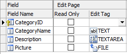
Properties
| Edit |
Show field in Edit page
Note The setting is for Edit page only, NOT for Inline/Grid-Add/Edit and Master/Detail-Add Edit in the List page. See the List setting above. |
| Title |
Title to be placed in title attribute of Edit Tag. (see section below) The title will also appear as popup tooltip of the Edit Tag.
Note If you use Multi-Language (see ASP.NET Settings), use Multi-Language Property Editor, see Tools for details. |
| Read Only |
Make the field read only in Edit page.
Note This setting replaces the Edit Tag by a INPUT type=hidden tag and show the field by its View Tag (see above). If you want to set the Edit Tag's readonly attribute (supported by INPUT type=text, INPUT type=password, TEXTAREA), use Row_Rendered server event. If you want to set the Edit Tag's disabled attribute, you can set <field>.Disabled property. (See Server Events and Client Script.) |
| Edit Tag |
Form element for the field.
Use in Add/Copy/Edit/Search pages. (See below for details) |
You can either click the [Edit Tag] column and select a Edit Tag from the drop down box or click the icon on the [Edit Tag] panel toolbar to select. After selecting the Edit Tag, you can further setup its properties in the Edit Tag panel:
Edit Tags
Edit Tags are HTML forms elements for the field in Add/Copy/Edit/Search pages. All HTML form elements are supported:
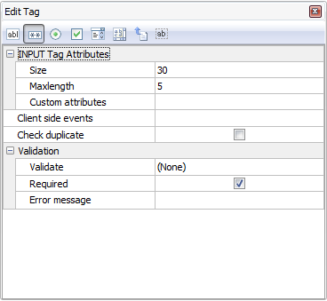
| Text |
<input type="text"> tag
Display the field as a textbox.
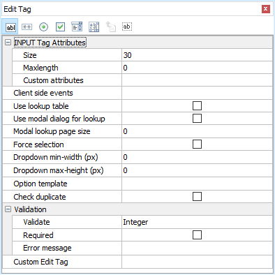
| Size |
Size attribute of the textbox |
| MaxLength |
Maximum input length of the textbox |
| Custom attributes |
Other custom attributes for the tag. For example, you can enter: (with quotes)
"onmouseover='my_js_function();'"
or Dictionary
new Dictionary<string, string> {{"onmouseover", "my_js_function();"}}
Notes
- The setting must be a valid C# expression. If it is string, it should be double quoted.
- If you use your own JavaScript functions for the client events. You can put your JavaScript functions in the Global Code for client scripts (see Server Events and Client Scripts) so it is available for use in the generated scripts.
- Sometimes the generated code already uses some attributes (e.g. onchange event, class attribute, style attribute), if you add the same attribute/event using the string format, there will be more than one event/attributes of the same name and it will be ignored by browsers. But if you add the same attribute using the Dictionary format, the attributes will be concatenated together. Therefore, the Dictionary format is recommended over the string format.
|
| Client side events |
See section below |
| Validation |
See section below |
| Use lookup table |
For use with Auto-Suggest and/or Auto-Fill (see below) with Lookup Table.
Auto-Suggest is Text Edit Tag with a Lookup Table. When user types in the textbox, a dynamic dropdown list populated with data from the lookup table matching the user input will appear for user to select. If the data already exists, the user can easily select without typing the full text. If not, the user can still input as usual. Check [Use lookup table] to enable Auto-Suggest and then enter the lookup table info in the [Lookup Table] panel next to the [Edit Tag] panel. See Lookup Table for more details. |
| Use modal dialog for lookup |
For use with Use lookup table. Adds a modal dialog for selecting a record from the lookup table, see Lookup Table for details. Supports searching, paging and option template (see below).
Note The modal dialog is same for TEXT/SELECT/RADIO/CHEKCBOX.
|
| Modal lookup page size |
For use with Use modal dialog for lookup. Specifies the number of records per page in the dialog. If not specified, default is 10. |
| Force selection |
For use with Auto-Suggest and/or Auto-Fill (see below) with Lookup Table. This setting must be enabled if you want to use Auto-Fill with Auto-Suggest.
When this setting is enabled, the user must select one of the auto-suggested options, the textbox will become similar to a combobox ("select-one"). This setting is usually enabled if the field is a lookup field, i.e. the field stores Link Field values (e.g. primary key) of the Lookup Table.
If this setting is disabled, the form will submit the user input (not the Link Field value) if no suggestion is selected, so make sure user input is acceptable. For example, if the Link field is same as the Display field #1, then disabling this setting should be fine and the field will save one of the suggestion (if selected) or what the user inputs.
If Allow sort/search (see Lookup Table) is enabled, usually the user wants to search the display value rather than the Link field value, so this setting is disabled automatically in the search forms, which will submit the selected suggestion's display value or the user input, and the script will search the display value of the field. |
| Dropdown min-width (px) |
Minimum width for dropdown. For use with Auto-Suggest only. |
| Dropdown max-height (px) |
Maximum height for dropdown. For use with Auto-Suggest only. |
| Option Template |
Optional JsRender template for options. For use with Auto-Suggest only. See Lookup Table for details. |
|
| Password |
<input type="password"> tag
Display the field as a masked textbox.
| Size |
Size attribute of the textbox |
| MaxLength |
Maximum input length of the textbox |
| Custom attributes |
Same as above (see Text Edit Tag) |
| Client side events |
See section below |
| Validation |
See section below |
|
| Radio |
<input type="radio"> tag
Display the field as a radio button list.
| Custom attributes |
Same as above (see Text Edit Tag) |
| Client side events |
See section below |
| Validation |
See section below |
| Use lookup table |
Use an existing lookup table instead of user input value/label pairs for the radio buttons. To enable this feature, check this option and enter the lookup table info in the [Lookup Table] panel next to the [Edit Tag] panel. See Lookup Table for details. If you don't use lookup table, you can enter the options
manually in the [User Value] panel next to the [Edit Tag] panel. |
| Use modal dialog for lookup |
For use with Use lookup table. Replaces radio buttons by a modal dialog for selecting a record from the lookup table, see Lookup Table for details. Supports searching, paging and option template (see below).
Note The modal dialog is same for TEXT/SELECT/RADIO/CHEKCBOX, while it has the same functionality of allowing user to select a record from the lookup table, it is NOT a radio button list (or dropdown, see below) anymore.
|
| Modal lookup page size |
For use with Use modal dialog for lookup. Specifies the number of records per page in the dialog. If not specified, default is 10. |
| Repeat columns |
Specifies the no. of radio boxes per row |
| Use dropdown |
Show the options in dropdown panel with min-width and max-height settings, e.g.
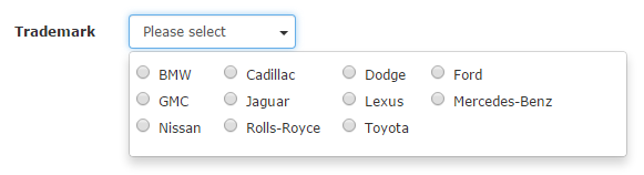
Note that if Repeat columns is 1 (single column), the options will be displayed same as dropdown selection list (Select Edit Tag with Use dropdown enabled, see below), radio buttons will be hidden, e.g.
|
| Dropdown min-width (px) |
Minimum width for dropdown |
| Dropdown max-height (px) |
Maximum height for dropdown |
| Option Template |
Optional JsRender template for options. See Lookup Table for details. |
|
| Checkbox |
<input type="checkbox"> tag
Display the field as a checkbox list.

Note For MySQL database, ASP.NET Maker considers enum('Y','N') and enum('1','0') as boolean fields. For Oracle database, fields with two and only two User Values (see below) and the labels and values are "Y" and "N" (or "1" and "0") will be considered as boolean fields. ASP.NET Maker will display a boolean field by a checkbox automatically.
| Custom attributes |
Same as above (see Text Edit Tag) |
| Client side events |
See section below |
| Validation |
See section below |
| Use lookup table |
Use an existing lookup table instead of user input value/label pairs for the checkboxes. To enable this feature, check this option and enter the lookup table info in the [Lookup Table] panel next to the [Edit Tag] panel. See Lookup Table for details. If you don't use lookup table, you can enter the options
manually in the [User Value] panel next to the [Edit Tag] panel. |
| Use modal dialog for lookup |
For use with Use lookup table. Replaces radio buttons by a modal dialog for selecting a record from the lookup table, see Lookup Table for details. Supports searching, paging and option template (see below).
Note The modal dialog is same for TEXT/SELECT/RADIO/CHEKCBOX, while it has the same functionality of allowing user to select a record from the lookup table, it is NOT a radio button list (or dropdown, see below) anymore.
|
| Modal lookup page size |
For use with Use modal dialog for lookup. Specifies the number of records per page in the dialog. If not specified, default is 10. |
| Repeat columns |
Specifies the no. of checkboxes per row |
| Use dropdown |
Show the options in dropdown panel with min-width and max-height settings, e.g.
Note that if Repeat columns is 1 (single column), the options will be displayed same as dropdown multiple selection list (Select Edit Tag with Multiple and Use dropdown enabled, see below), e.g.
|
| Dropdown min-width (px) |
Minimum width for dropdown |
| Dropdown max-height (px) |
Maximum height for dropdown |
| Option Template |
Optional JsRender template for options. See Lookup Table for details. |
Note The submitted values of the multi-selected checkboxes is a comma-separated string. Therefore you must use a string field
for checkbox list. |
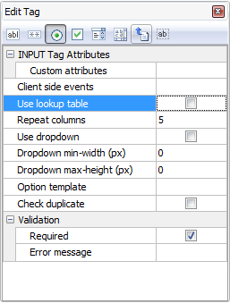
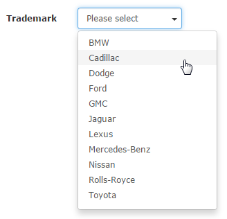
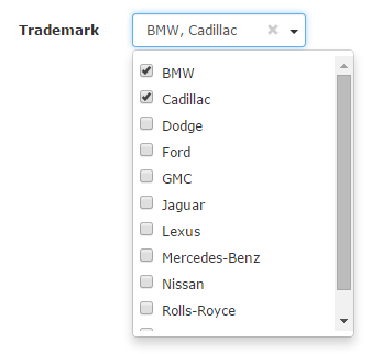
| Select |
<select> tag
Display the field as a combobox ("select-one") or a listbox ("select-multiple").

| Size |
No. of options to show. If more that 1, the
selection list is shown as a listbox, otherwise it is shown as a
combobox. |
| Multiple |
Check to enable multiple selection (listbox) |
| Custom attributes |
Same as above (see Text Edit Tag) |
| Client side events |
See section below |
| Validation |
See section below |
| Use lookup table |
Use an existing lookup table instead of user input value/label pairs for the checkboxes. To enable this feature, check this option and enter the lookup table info in the [Lookup Table] panel next to the [Edit Tag] panel. See Lookup Table for details. If you don't use lookup table, you can enter the options
manually in the [User Value] panel next to the [Edit Tag] panel. |
| Use modal dialog for lookup |
For use with Use lookup table. Replaces checkboxes by a modal dialog for selecting multiple records from the lookup table, see Lookup Table for details. Supports searching, paging and option template (see below).
Note The modal dialog is same for TEXT/SELECT/RADIO/CHEKCBOX, while it has the same functionality of allowing user to select multiple records from the lookup table, it is NOT a checkbox list (or dropdown, see below) anymore.
|
| Modal lookup page size |
For use with Use modal dialog for lookup. Specifies the number of records per page in the dialog. If not specified, default is 10. |
| Repeat columns |
Specifies the no. of checkboxes per row |
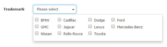
| Use dropdown |
Show the options in dropdown panel with min-width and max-height settings, e.g.
select-one (Multiple disabled)
select-multiple (Multiple enabled)
Note If Use dropdown is used, the HTML element is NOT <select> anymore. The dropdown panel uses radio buttons (if Multiple disabled) or checkboxes (if Multiple enabled) to support Option Template (see below). If you need to write JavaScript for the HTML elements, make sure you write code for correct HTML elements. Inspect HTML source in your browser to view the HTML elements.
|
| Dropdown min-width (px) |
Minimum width for dropdown |
| Dropdown max-height (px) |
Maximum height for dropdown |
| Option Template |
Optional JsRender template for options. See Lookup Table for details.
Note If Use dropdown is not used, the HTML element is native <select> element, which usually does NOT support HTML tags in options (depending on browsers), though HTML entities are supported.
|
|
| TextArea |
<textarea> tag
Display the field as a textarea.
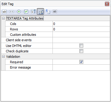
| Cols |
No. of columns of the textarea |
| Rows |
No. of rows of the textarea |
| Custom attributes |
Same as above (see Text Edit Tag) |
| Client side events |
See section below |
| Validation |
See section below |
| Use HTML Editor |
Replace the textarea with a DHTML editor for editing the data as HTML. See Third-party Tools for more info on DHTML Editors. |
|
| File |
<input type="file"> tag
Display the field as a file upload control. For BLOB fields or string fields only.
Note File upload supports displaying thumbnails of uploaded image. The feature supports GIF, JPEG and PNG images only.
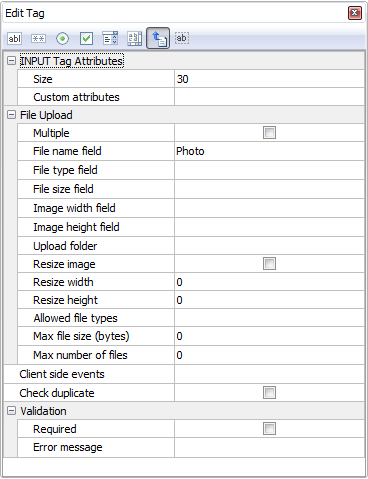
| Size |
Size of the input tag (NOT file size) |
| Custom attributes |
Same as above (see Text Edit Tag) |
| Client side events |
See section below |
| Validation |
See section below |
If the field is of BLOB (binary) data type, file is uploaded to the database.
You can also store the information of the uploaded file in the following fields:
File type field - Recommended. Useful when you want to response to user browser the exact content type of the data.
File name field - Optional. Useful if you want to use the original filename.
Note Do not specify file name field if you want IE to open the file automatically. (IE may fail to open non-image files retrieved from database properly.) Use file name field if you want IE to popup a File Download dialog for user to save the file with the filename specified in the file name field.
File size field - Optional. Stores the uploaded file size.
Image width field - Optional. For use with images only. Stores the width of the uploaded image.
Image height field - Optional. For use with images only. Stores the height of the uploaded image.
If the field of string type, file is uploaded to a subfolder relative to the wwwroot.
Multiple - Allow multiple upload. Field value will be comma separated file names. NOT application to BLOB field.
Upload folder - the folder where the uploaded file will reside. If you do not enter a specific folder, all the uploaded files will be put in the global upload folder specified in the ASP.NET tab (see ASP.NET Setup).
Notes
- Unlike the global upload folder setting (which is a constant and must be a string without double quotes), this field specific setting must be a valid C# expression. If it is a string, it must be double quoted.
- Make sure that the Web server user have read/write access to the folder.
- The path can be dynamic. For example, if the upload path varies with some field value, you can refer to other fields by <Field>.DbValue. However, you must be very careful when using dynamic folder, make sure the setting is valid as a folder name, i.e. it does not contain some characters which can not be used in a file path on your server. The setting will be evaluated to obtain the upload folder before the file is displayed and before the uploaded file is saved, so your setting should be consistent, do not use random number or date/time to name the folder. Alternatively, you can also use Row_Rendered, Row_Inserting and Row_Updating server events to set the field object's UploadPath property.
- If Multiple is enabled, all upload files use the same upload folder.
- The path is relative to wwwroot. Use slashes "/" as path delimiter, no leading slash. e.g. If the application root of your website is C:\Inetpub\wwwroot\demo and you enter "uploads/" in this textbox, the folder for the uploaded files will be C:\Inetpub\wwwroot\demo\wwwroot\uploads. If you must use another absolute path, use the Advanced Setting File upload path (absolute) for temporary files.
- Make sure that the Web server user have read/write access to the folder.
Resize image - Optionally resize the image to resize width and/or height.
Resize width - the width of the resized image
Resize height - the height of the resized image
Allowed file types - Comma separated file extensions (e.g. jpg,png,gif) without spaces and quotes. If not specified, the global setting (see ASP.NET Settings -> General Options -> File Upload) will be used.
Note For security, the field-specific Allowed file types must be included in the allowed file types under ASP.NET Settings -> General Options -> File Upload.
Max file size (bytes) - The maximum allowed file size in bytes. (Requires browsers supporting the File API.) If not specified, the global setting (see ASP.NET Settings -> General Options -> File Upload) will be used.
Max number of files - The maximum number of files that are allowed to be uploaded if Multiple (see above) is enabled. It must be larger than 1. (If you just allow one file, disable Multiple.) If not specified, unlimited file uploads are allowed. Since file names are stored as comma separated value in the field, the max number of files is also limited by the field size defined in the database.
|
| Hidden |
<input type="hidden"> tag
Hide the field with a hidden form element.
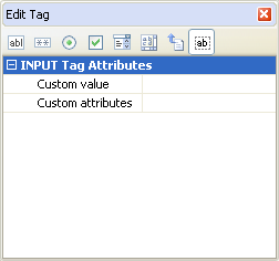
Note This is different from de-selecting the field in the [Edit] column. If a field is de-selected, no code will be generated for the field in the Edit page and the field will not be updated. With a hidden form element the field is not seen but it may still get updated.
Custom value - by default the 'value' attribute contains the field value, custom value is used to update the field with another value when a record is updated using the Edit page.
Notes
- Custom value is used in Edit page only. It cannot be used with Read-only fields, User ID fields and Detail fields(Foreign key fields)
- In Add page, if a default value is specified (see section below), hidden form element will also be used but the 'value' attribute will contain the default value. If default value is not specified, the field will be displayed as a normal textbox.
- Other preferable ways of updating a hidden field is to use Auto-Update Value (see above) or to use Row_Inserting and/or Row_Updating server events.
Custom attributes - same as above (see Text Edit Tag) |
| Custom Edit Tag |
| Custom Edit Tag |
Display the field value in Add/Edit/Search pages by custom code.
Important
- Custom Edit Tag overrides ALL above Edit Tag settings.
- Custom Edit Tag is only a provision for your own code or your own implementation of third party tools. If you choose to enter your own code, you are completely on your own to edit the field value. Intermediate knowledge in C#, HTML, CSS and JavaScript is required. NO TECHNICAL SUPPORT WILL BE PROVIDED for any third-party tools.
- Only one Custom Edit Tag can be selected at a time. All records will use the same Custom Edit Tag. You cannot use a Custom Edit Tag for a record and use another Custom Edit Tag for next record.
- The sample Custom Edit Tag is provided as examples only. The third party tools used is not developed by the author of ASP.NET Maker and is not part of ASP.NET Maker, NO TECHNICAL SUPPORT WILL BE PROVIDED.
To use Custom Edit Tag, click the down arrow button to open the setup form, enable one of them, read the notes at the bottom panel carefully, then click the Settings tab to setup, and click OK to save your settings.
You must create your own Custom Edit Tag, they are implemented in exactly the same way as template extensions (see Customizing Template). Custom Edit Tags must be placed under the subfolder "customedittags" of the installation folder. Each Custom View Tag is basically a XML description file. You can open the sample Custom Edit Tag's XML file in the "customedittags" subfolder to see the content, which is self-explanatory.
Example
<?xml version="1.0" encoding="iso-8859-1" ?>
<ew-extension id="colorpicker" name="Colorpicker" version="1.0.0" type="Custom Edit Tag" author="e.World">
<description>
<![CDATA[
COMMENTS
]]>
</description>
<file>colorpicker.zip</file>
<script>plugins/colorpicker/bootstrap-colorpicker.min.js</script>
<stylesheet>plugins/colorpicker/bootstrap-colorpicker.min.css</stylesheet>
<Code><![CDATA[
{{{old_tag}}}
<script type="text/javascript">
$("[id='{{{id}}}']:not([id*='$rowindex$'])").colorpicker({ format: "hex" });
</script>
]]></Code>
</ew-extension>
| id |
Unique ID of the Custom Edit Tag. Should contains alphanumeric characters only, e.g. "colorpicker". |
| file |
(Optional) External files required by the Custom Edit Tag (zip file). If the files are always available in the website (e.g. your Custom Edit Tag only uses JavaScript from CDN), you do not need this setting.
The zip file must be placed in the same folder of the XML file, i.e. the "customedittags" folder. In the zip file, there must be a Control File (control.xml) specifying where these external files to be copied to.
Example
<control id="colorpicker" type="copy" action="add" remark="Copy Colorpicker plugin" ofolder="plugins" ifolder="plugins" />
This tells ASP.NET Maker to perform an additional task of copying the input folder "plugins" (in the zip file) to the output folder "plugins" (same name in this case) under the destination folder of the project.
|
| script |
(Optional) JavaScript required by the Custom Edit Tag.
Note In more than one scripts, delimit them by | (vertical bar), NOT line breaks, e.g. <script>//host/path/xxx.js|//host2/path2/yyy.js</script>
The path(s) can be absolute URL, relative URL or absolute physical path, read Scripts and Stylesheets for details. |
| stylesheet |
(Optional) CSS stylesheets required by Custom Edit Tag.
Note In more than one scripts, delimit them by | (vertical bar), NOT line breaks, e.g. <stylesheet>//host/path/xxx.css|//host2/path2/yyy.css</stylesheet>
The path(s) can be absolute URL, relative URL or absolute physical path, read Scripts and Stylesheets for details. |
| Code |
The custom code of the Custom Edit Tag.
Custom Edit Tag is HTML and C#, if you want to embed C# code, use @, if you want to use JavaScript, use <script type="text/javascript"> and </script>.
Notes
- Make sure your code is inside <![CDATA[...]]>.
- You can use CurrentPage() to get the current page object.
The following special tags are supported:
| {{{old_tag}}} |
The old (original) Edit Tag, that is, the original code for the field. If you reuse the original code without changes (e.g. you just add some additional code for the field), you can use the special tag {{{old_tag}}} in your code
Example 1
{{{old_tag}}}
<script>
$("[id='{{{id}}}']:not([id*='$rowindex$'])").colorpicker({ format: "hex" });
</script>
Example 2
If {{{old_tag}}} is inside JsRender template (<script class="ew-js-template" type="text/html">...</script>), it will only be converted to a JsRender Include tag {{include tmpl=... /}} to include the template of original code.
<script class="ew-js-template" type="text/html">
{{{old_tag}}}
<script>
$("[id='{{{id}}}']:not([id*='$rowindex$'])").colorpicker({ format: "hex" });
</script>
</script> |
| {{{id}}} or {{{name}}} |
The id or name attribute of the HTML element of the field.
Example
$("[id='{{{id}}}']:not([id*='$rowindex$'])").colorpicker({ format: "hex" });
Note {{{id}}} will not change for each <input> tag for RADIO/CHECKBOX, always use name="{{{name}}}" for RADIO/CHECKBOX. |
| {{{value}}} |
The CurrentValue of the field object. It will converted to @<page>.<field>.CurrentValue. Note that it includes the @tags, use it in HTML only, do not use it in C# code. |
| {{{edit_value}}} |
The EditValue of the field object. It will converted to @<page>.<field>.EditValue. Note that it includes the @tags, use it in HTML only, do not use it in C# code.
Example
<input id="{{{id}}}" name="{{{name}}}}" value="{{{edit_value}}}" class="form-control" ... /> |
| {{{view_value}}} |
The ViewValue of the field object. It will converted to @<page>.<field>.ViewValue. Note that it includes the @tags, use it in HTML only, do not use it in C# code. |
| {{{tag_id}}} |
The id of the JsRender Template containing the original Edit Tag. If your Custom Edit Tag is also a JsRender Template, you can reuse it by including the template.
Example
<script class="ew-js-template" type="text/html">
{{include tmpl="#{{{tag_id}}}"/}}
<script>
$("[id='{{{id}}}']:not([id*='$rowindex$'])").colorpicker({ format: "hex" });
</script>
</script> |
|
If you want absolute freedom, click the [...] button to enter your own code to display the your data in your own C#, HTML, CSS and JavaScript. You can enter JavaScript and stylesheet paths in the JavaScripts(Global) and Stylesheets(Global) respectively. One line for each path. Note that the paths are global for the whole project, not just for a field, you'll see JavaScript and stylesheet paths required by other fields. A JavaScript or stylesheet may depends on other, you can move them up or down to make sure the sequences are correct.
Note If the JavaScript(s) and/or stylesheet(s) are not provided by the Custom Edit Tag itself, make sure the paths are correct and the scripts/stylesheets already exist on the server. |
Using User Values for Edit Tag (Radio/Checkbox/Select)
For Radio/Checkbox/Select Edit Tags, the default option values are user input values, you can enter as many value/label pairs as you want in the [User Values] panel next to the [Edit Tag] panel.
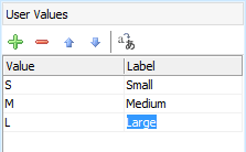
Note For boolean fields, if you use Radio Edit Tag with User Values, the first value/label should be for True and the second for False.
Using Lookup Table for Edit
Tag (Text/Radio/Checkbox/Select)
In real world applications, the option values usually come from a (lookup) table in the database. ASP.NET Maker make it very simple to use lookup values for key field values, simple click [Use Table], the [Lookup Table] panel will replace the [User Values] panel, see Lookup Table for details.
Dynamic Selection Lists
ASP.NET Maker supports Dynamic Selection Lists in which child lookup fields' selection list
options change dynamically based on option selected in the parent selection
list. To setup child lookup fields, click the [Child lookup fields...] button and the following setup form will be displayed:
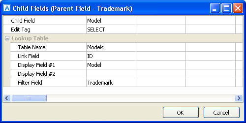
Read Tutorial - Dynamic Selection List for more information.
Client side events (for Add/Copy/Edit/Search)
You can manipulate fields on the client side quickly with ASP.NET Maker's "fields" jQuery plugin (see Server Events and Client Scripts).
Example 1
Set field values based on current field value
{ // keys = event types, values = handler functions
"change": function(e) {
if (this.value == "xxx") {
$(this).fields("FieldA").value("yyy"); // Set value to FieldA
//$(this).fields("FieldA").visible(false); // true to show, false to hide
//$(this).fields("FieldA").readonly(true); // true as readonly, false as normal (for Text and TextArea only)
//$(this).fields("FieldA").disabled(true); // true as disabled, false as normal
} else {
$(this).fields("FieldB").value("zzz"); // Set value to FieldB
}
}
}
Example 2
Client side calculation based on user input
{ // keys = event types, values = handler functions
"change keyup": function(e) {
var $row = $(this).fields(); // Get an object of all fields, each property is a jQuery object of the input element(s) of a field
var st = $row["UnitPrice"].toNumber() *
$row["Quantity"].toNumber() *
(1 - $row["Discount"].toNumber()); // Convert to number and calculate
$row["SubTotal"].value(st); // Set result to a field
}
}
Note All client side events are generated in the script userevt<version>.js, after changing client side events, remember to re-generate the .js file.
Validation (for Add/Copy/Edit/Search)
The data input for each field can be validated using client-side JavaScript.
| Validate |
Supported validation formats are:
- Integer
- Float
- Range - for validating a range of number
- Date - for validating date with or without time
- Time - for validating time with or without seconds
- Email
- Credit card
- GUID
- US phone number
- US zip code
- US social
security number
- Regular Expression
Notes
- The actual date/time separator during runtime is determined by locale file, see:
- Customizing Template -> Locale Files, and
- Tools -> Locale Settings
- If Regular Expression, client side and server side arguments must be entered, depend on if you have enabled client-side and server-side validation (see ASP.NET Settings), see Arguments (Client-side) and Arguments (Server-side) below.
- You can add your own functions for validation. The function must accept at least one argument (the value) and return true (valid value) or false (invalid value). If your functions requires additional arguments, see Arguments (Client-side) and Arguments (Server-side) below. You can add your function names (comma separated) in the Advanced Setting CustomValidationFunctions. (See Tools.) Note that since it is both JavaScript and C# function name, it must be a string that corresponds to a valid identifier for both sides. For example, you can enter "myValidateFunction1,myValidateFunction2" (no quotes). If you have enabled client side validation, you need to provide your JavaScript function. If you have enabled server-side validation, you need to provide your C# function. You can put your functions in the Global Code section for server and client scripts respectively (see Server Events and Client Scripts) so they are available for use in the generated scripts.
|
| Arguments (Client-side) |
Arguments for the JavaScript functions for validation. For Regular Expression and custom validation functions only.
Note This is JavaScript arguments, it should be comma separated (if more than one) JavaScript expressions. e.g. If it is a string, it must be single or double quoted.
If the Validate setting (see above) is Regular Expression, this setting must be a valid JavaScript regular expression pattern along with flags that identify how to apply the pattern (delimit the pattern by "/" characters, not single or double quotes), e.g.
/foobar/i
See Creating a Regular Expression for more information about the pattern and flags. |
| Arguments (Server-side) |
Arguments for the C# functions for validation. For Regular Expression and custom validation functions only.
Note This is C# arguments, it should be comma separated (if more than one) C# expressions. e.g. If it is a string, it must be double quoted.
If the Validate setting (see above) is Regular Expression, this setting must be a valid C# regular expression pattern. If you use regular expression options, you must use inline options in the regular expression pattern with the syntax (?imnsx-imnsx), e.g.
@"(?i)foobar"
This pattern uses inline options to enable case-insensitive matching.
See Regular Expression Language - Quick Reference and Regular Expression Options for more information about regular expression and inline options. |
| Use date/time picker |
Check this option to use a JavaScript date/time picker instead of manual input.
Notes
- Popup calendar is only available for validation formats Date, you must select the Date format first.
- Time picker is only available for Time validation format, you must select the Time format first.
- The popup calendar is not developed by the author of ASP.NET Maker and no technical support will be provided. (See Third-party Tools.)
|
| Required |
Check this checkbox if the field is mandatory.
Notes
- If the field is defined as NOT NULL in your database, the field is required even this option is not enabled.
If you do not want to validate NOT NULL field, you can disable the advanced setting
Validate NOT NULL fields.
- By default required fields will be denoted by an asterisk beside the field caption. You can change the asterisk to other or remove it in the language file.
|
| Error message |
Enter the error message to popup if error occurs.
Note If you use Multi-Language (see ASP.NET Settings), use Multi-Language Property Editor, see Tools for details. |
| Check duplicate |
Specify whether to check duplicate values for the field before editing or inserting a record.
If the field is an unique indexed field, ASP.NET Maker will generate server side codes to check duplicate values automatically even this option is not selected. This option is useful when you want to check a non unique indexed fields for duplicated values. |
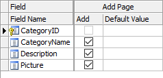
Add Page
Properties
| Add |
Show field in Add page
Note The setting is for Add page only, NOT for Inline/Grid-Add/Edit and Master/Detail-Add Edit in the List page. See the List setting above. |
| Default Value |
Default value for field (for adding new record only) . The value must be a valid C# expression. (If it is a string, must be double quoted.) |
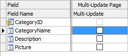
Multi-Update Page
Properties
| Multi-Update |
Show field in Multi-Update page
If a field is selected, it will be included in the Multi-Update page. In the generated Multi-Update page, there is a checkbox for each field, the field will only be updated if the checkbox is checked so users can update only the checked fields without affecting values of the other unchecked fields. |
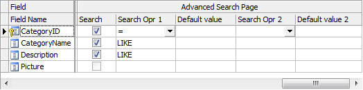
Advanced Search Page
Properties
| Search |
Show field in Advanced Search page (Note: NOT related to Quick
Search) |
| Search Opr 1 |
Search operator #1 for the field. Used in Advanced Search or Extended Quick Search. |
| Default Value |
Default value for Search Opr 1.
The value must be a valid C# expression. (If it is a string, must be double quoted.) |
| Search Opr 2 |
Search operator #2 for the field. Used in Advanced Search or Extended Quick Search.
Notes
- This second search operators will be useful when you need 2 criteria for the field when searching. You can also select AND/OR to relate the 2 criteria during runtime.
- If you want to use "BETWEEN" search operator, select "BETWEEN" as the first search operator. Since "BETWEEN" requires 2 search criteria, when it is used, the second search operator will be ignored.
|
| Default Value 2 |
Default value for Search Opr 2 .
The value must be a valid C# expression. (If it is a string, must be double quoted.) |
Also See:
Custom Fields
